
Yes, one accented state + a small warning banner when off (that can be dismissed) is what I have in a branch for now. Let’s see if we’ll need this banner. I’m just worried about the situation when you turn capturing off, then being in stress forget about it and happy that no new errors are coming.
Maybe the Log node could show a warning if the Log Window is not capturing? Wouldn’t that be too invasive?
then chrome’s solution would tackle your concern.
a mixture of chromes and firefoxes solution would tackle your concern.
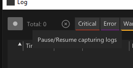
while in capture/recording state the button is just default ui colored. only when you turn it off it is accented in the warning color, so one immediately has a focus on what might be off while expecting messages.
It’s definitely better than before, but I don’t really like this solution (it seems to make more sense to have two colours in such a setup). I think that very specific browser development tools can’t be considered as reference designs for interfaces. That’s just my personal opinion, and it’s perfectly fine to ignore it.
Let me make the obvious and suggestive remarks:
-
Let the tooltip make it clear that it will do this for this action: “click to pause”, “click to start recording”.
-
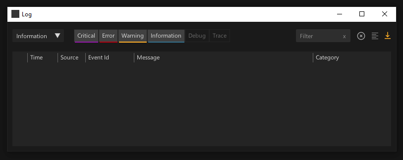
How about putting the state in the window title bar? Log: “Recording / Pausing”. It also gives a hint when you hover over it in the Windows taskbar.
maybe it even better! 5.3-0403
But on a more serious note, instead of removing the button altogether, perhaps we could do what was suggested from the start - Selected and Unselected. Selected as the ON state and Unselected as the OFF state. Maybe even reflect this in the window title (e.g. for “stopped” state).
This topic was automatically closed 365 days after the last reply. New replies are no longer allowed.